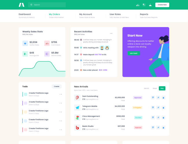
Basic Example
Use the
.ribbonclass within the
.card-headerelement of a
.cardcomponent. Then add the ribbon content within the
.card-headerThis example uses a simple ribbon on a card component.Ribbon Example
Ribbon
Lorem Ipsum is simply dummy text of the printing and typesetting industry. Lorem Ipsum has been the industry's standard dummy text ever since the 1500s, when an unknown printer took a galley of type and scrambled it to make a type specimen book. It has survived not only five centuries, but also the leap into electronic typesetting, remaining essentially unchanged. It was popularised in the 1960s with the release of Letraset sheets containing Lorem Ipsum passages, and more recently with desktop publishing software like Aldus PageMaker including versions of Lorem Ipsum.
<div class="card card-bordered">
    <div class="card-header ribbon">
        <div class="card-title">Ribbon Example</div>
        <div class="ribbon-label bg-primary">Ribbon</div>
    </div>
    <div class="card-body">
        ...
    </div>
</div>
Rounded Corners
Add
Please note that the ribbon may overlap your card title, so align your titles accordingly.
.ribbon-[direction]to add rounded corners on the specified ribbon edge. The direction options are
start,
end,
topand
bottom.
Please note that the ribbon may overlap your card title, so align your titles accordingly.
Ribbon Example
Ribbon
Lorem Ipsum is simply dummy text of the printing and typesetting industry. Lorem Ipsum has been the industry's standard dummy text ever since the 1500s, when an unknown printer took a galley of type and scrambled it to make a type specimen book. It has survived not only five centuries, but also the leap into electronic typesetting, remaining essentially unchanged.
Ribbon
Ribbon Example
Lorem Ipsum is simply dummy text of the printing and typesetting industry. Lorem Ipsum has been the industry's standard dummy text ever since the 1500s, when an unknown printer took a galley of type and scrambled it to make a type specimen book. It has survived not only five centuries, but also the leap into electronic typesetting, remaining essentially unchanged.
<!--begin::Card-->
<div class="card card-bordered">
    <div class="card-header ribbon ribbon-end">
        <div class="ribbon-label bg-primary">Ribbon</div>
        <div class="card-title">Ribbon Example</div>
    </div>

    <div class="card-body">
        ...
    </div>
</div>
<!--end::Card-->

<!--begin::Card-->
<div class="card card-bordered">
    <div class="card-header ribbon ribbon-top">
        <div class="ribbon-label bg-primary">Ribbon</div>
        <div class="card-title">Ribbon Example</div>
    </div>

    <div class="card-body">
        ...
    </div>
</div>
<!--end::Card-->

<!--begin::Card-->
<div class="card card-bordered">
    <div class="card-header justify-content-end ribbon ribbon-start">
        <div class="ribbon-label bg-primary">Ribbon</div>
        <div class="card-title">Ribbon Example</div>
    </div>

    <div class="card-body">
        ...
    </div>
</div>
<!--end::Card-->
Vertical Ribbons
Add
.ribbon-verticaltogether with
.ribbon-topto add a vertical ribbon.OK!
Ribbon Example
Lorem Ipsum is simply dummy text of the printing and typesetting industry. Lorem Ipsum has been the industry's standard dummy text ever since the 1500s, when an unknown printer took a galley of type and scrambled it to make a type specimen book.
Ribbon Example
Lorem Ipsum is simply dummy text of the printing and typesetting industry. Lorem Ipsum has been the industry's standard dummy text ever since the 1500s, when an unknown printer took a galley of type and scrambled it to make a type specimen book.
<!--begin::Card-->
<div class="card card-bordered">
    <div class="card-header ribbon ribbon-top ribbon-vertical">
        <div class="ribbon-label bg-danger">
            OK!
        </div>
        <div class="card-title">Ribbon Example</div>
    </div>
    <div class="card-body">
        ...
    </div>
</div>
<!--end::Card-->

<!--begin::Card-->
<div class="card borcard-borderedder">
    <div class="card-header ribbon ribbon-top ribbon-vertical">
        <div class="ribbon-label bg-success">
            <i class="bi bi-heart-fill fs-2 text-white"></i>
        </div>
        <div class="card-title">Ribbon Example</div>
    </div>
    <div class="card-body">
        ...
    </div>
</div>
<!--end::Card-->
Clip Ribbons
Add
.ribbon-clipand
.ribbon-innerto add a clip style ribbon edge.Ribbon
Ribbon Example
Lorem Ipsum is simply dummy text of the printing and typesetting industry. Lorem Ipsum has been the industry's standard dummy text ever since the 1500s, when an unknown printer took a galley of type and scrambled it to make a type specimen book. It has survived not only five centuries, but also the leap into electronic typesetting, remaining essentially unchanged.
Ribbon
Ribbon Example
Lorem Ipsum is simply dummy text of the printing and typesetting industry. Lorem Ipsum has been the industry's standard dummy text ever since the 1500s, when an unknown printer took a galley of type and scrambled it to make a type specimen book. It has survived not only five centuries, but also the leap into electronic typesetting, remaining essentially unchanged.
<!--begin::Card-->
<div class="card card-bordered">
    <div class="card-header ribbon ribbon-end ribbon-clip">
        <div class="ribbon-label">
            Ribbon
            <span class="ribbon-inner bg-info"></span>
        </div>
        <div class="card-title">Ribbon Example</div>
    </div>
    <div class="card-body">
        ...
    </div>
</div>
<!--end::Card-->

<!--begin::Card-->
<div class="card card-bordered">
    <div class="card-header justify-content-end ribbon ribbon-start ribbon-clip">
        <div class="ribbon-label">
            Ribbon
            <span class="ribbon-inner bg-success"></span>
        </div>
        <div class="card-title">Ribbon Example</div>
    </div>
    <div class="card-body">
        ...
    </div>
</div>
<!--end::Card-->
Triangle Ribbons
Use
.ribbon-triangletogether with one of
.ribbon-top-start,
.ribbon-top-start,
.ribbon-top-start,
.ribbon-top-startdirection classes to have a triangle stle ribbon with icons positioned with the Bootstrap margin utility classes. Use
.border-{color}class to set a ribbon color:Ribbon Example
Lorem Ipsum is simply dummy text of the printing and typesetting industry. Lorem Ipsum has been the industry's standard dummy text ever since the 1500s, when an unknown printer took a galley of type and scrambled it to make a type specimen book.
Ribbon Example
Lorem Ipsum is simply dummy text of the printing and typesetting industry. Lorem Ipsum has been the industry's standard dummy text ever since the 1500s, when an unknown printer took a galley of type and scrambled it to make a type specimen book.
Ribbon Example
Lorem Ipsum is simply dummy text of the printing and typesetting industry. Lorem Ipsum has been the industry's standard dummy text ever since the 1500s, when an unknown printer took a galley of type and scrambled it to make a type specimen book.
Ribbon Example
Lorem Ipsum is simply dummy text of the printing and typesetting industry. Lorem Ipsum has been the industry's standard dummy text ever since the 1500s, when an unknown printer took a galley of type and scrambled it to make a type specimen book.
<!--begin::Ribbon wrapper 1-->
<div class="overflow-hidden position-relative card-rounded">
    <!--begin::Ribbon-->
    <div class="ribbon ribbon-triangle ribbon-top-start border-primary">
        <!--begin::Ribbon icon-->
        <div class="ribbon-icon mt-n5 ms-n6">
            <i class="bi bi-check2 fs-2 text-white"></i>
        </div>
        <!--end::Ribbon icon-->
    </div>
    <!--end::Ribbon-->

    <!--begin::Card-->
    <div class="card card-bordered">
        <!--begin::Header-->
        <div class="card-header ribbon ribbon-top ribbon-vertical">
            <div class="card-title">Ribbon Example</div>
        </div>
        <!--end::Header-->

        <!--begin::Body-->
        <div class="card-body">
            ...
        </div>
        <!--end::Body-->
    </div>
    <!--end::Card-->
</div>
<!--end::Ribbon wrapper 1-->

<!--begin::Ribbon wrapper 2-->
<div class="overflow-hidden position-relative card-rounded">
    <!--begin::Ribbon-->
    <div class="ribbon ribbon-triangle ribbon-top-start border-primary">
        <!--begin::Ribbon icon-->
        <div class="ribbon-icon mt-n5 me-n6">
            <?php echo Theme::getSvgIcon("icons/duotune/electronics/elc006.svg", "svg-icon-2 svg-icon-white")?>
        </div>
        <!--end::Ribbon icon-->
    </div>
    <!--end::Ribbon-->

    <!--begin::Card-->
    <div class="card card-bordered">
        <!--begin::Header-->
        <div class="card-header ribbon ribbon-top ribbon-vertical">
            <div class="card-title">Ribbon Example</div>
        </div>
        <!--end::Header-->

        <!--begin::Body-->
        <div class="card-body">
            ...
        </div>
        <!--end::Body-->
    </div>
    <!--end::Card-->
</div>
<!--end::Ribbon wrapper 2-->

<!--begin::Ribbon wrapper 3-->
<div class="overflow-hidden position-relative card-rounded">
    <!--begin::Card-->
    <div class="card card-bordered">
        <!--begin::Header-->
        <div class="card-header ribbon ribbon-top ribbon-vertical">
            <div class="card-title">Ribbon Example</div>
        </div>
        <!--end::Header-->

        <!--begin::Body-->
        <div class="card-body">
            ...
        </div>
        <!--end::Body-->
    </div>
    <!--end::Card-->

    <!--begin::Ribbon-->
    <div class="ribbon ribbon-triangle ribbon-bottom-start border-danger">
        <!--begin::Ribbon icon-->
        <div class="ribbon-icon mt-0 ms-n6">
            <i class="las la-highlighter fs-2 text-white"></i>
        </div>
        <!--end::Ribbon icon-->
    </div>
    <!--end::Ribbon-->
</div>
<!--end::Ribbon wrapper 3-->

<!--begin::Ribbon wrapper 4-->
<div class="overflow-hidden position-relative card-rounded">
    <!--begin::Card-->
    <div class="card card-bordered">
        <!--begin::Header-->
        <div class="card-header ribbon ribbon-top ribbon-vertical">
            <div class="card-title">Ribbon Example</div>
        </div>
        <!--end::Header-->

        <!--begin::Body-->
        <div class="card-body">
            ...
        </div>
        <!--end::Body-->
    </div>
    <!--end::Card-->

    <!--begin::Ribbon-->
    <div class="ribbon ribbon-triangle ribbon-bottom-start border-gray-300">
        <!--begin::Ribbon icon-->
        <div class="ribbon-icon mt-0 me-n6">
            <i class="bi bi-pencil fs-2 text-white"></i>
        </div>
        <!--end::Ribbon icon-->
    </div>
    <!--end::Ribbon-->
</div>
<!--end::Ribbon wrapper 4-->


